If you told me that a typeface can be animated just by its letters being typed out or that one can compete in rock, paper, scissors with a typeface, my thoughts would have long floated elsewhere as these are unimaginable to my mind. However, that is prior to attending the Game of Glyphs talk because my mind now is forever changed.
Over the weekend of the 18th Oct, the folks at Huruf and Fictionist Studio organised a talk and workshop to introduce fellow type and design enthusiasts in KL to the Glyphs app – a professional type design software. Presenting the app was non other than Rainer Erich Scheichelbauer, type designer and part creator of the app itself.
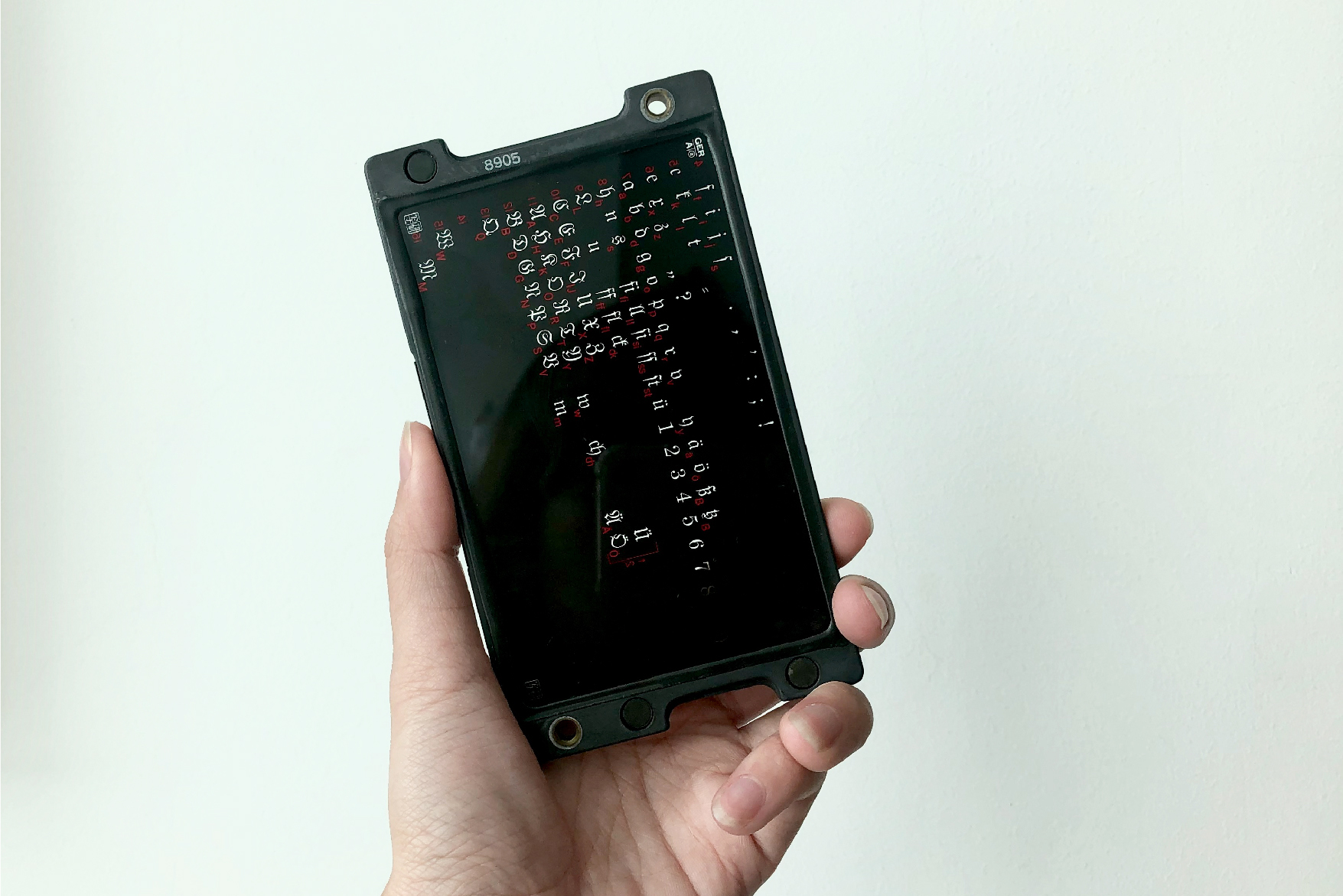
From the get-go, Rainer shared about how fonts are made and how the process have evolved over the years. It was here that I learned of such a thing as phototypesetting, which Rainer briefly introduced to the audience. Before the computer, phototypesetting is a method of setting type that uses a photographic process to compose text on a film. It is a revelation to me and was even more surprised to find out that we have a phototype plate in the studio, one which Mag received as a gift from her friend. (See Image 5)
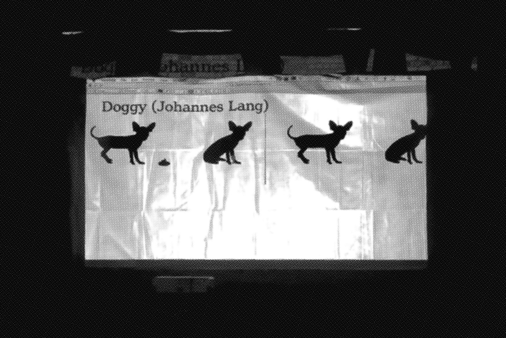
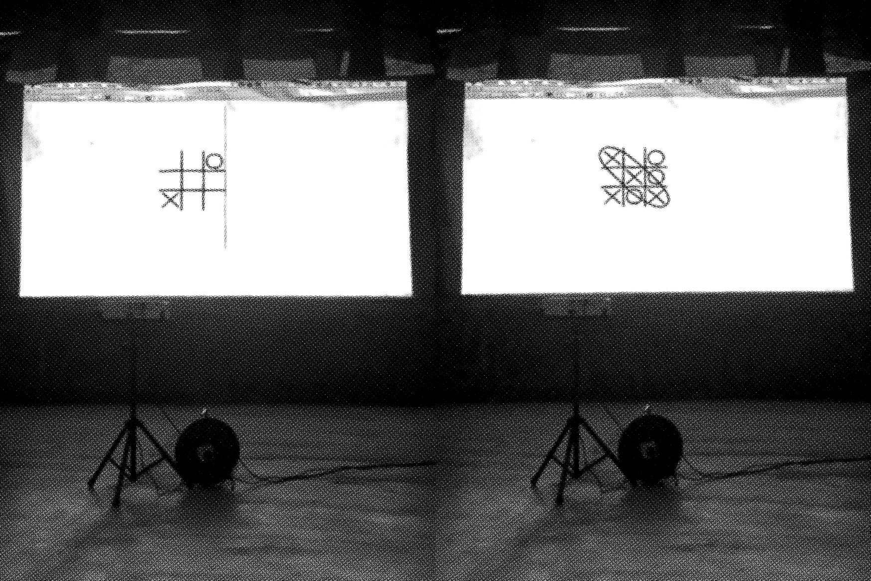
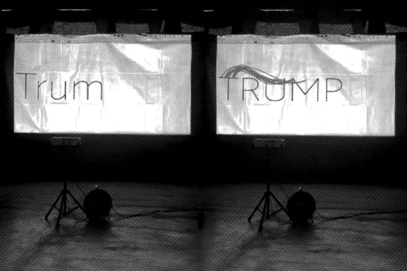
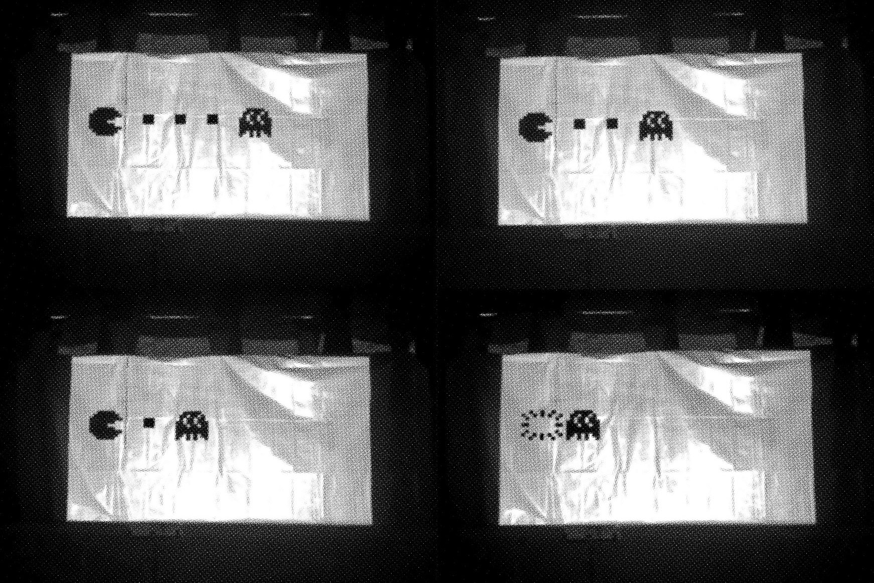
Nearing the end of the talk, Rainer showed us handfuls of typefaces that utilises Open Type Feature as well as variable fonts in mind-blowing ways; some of which were designed by him, his students and typographic associates. All of which left me in awe. What if your dog becomes the letter you typed out? Have you ever think of making animations by just typing? Whenever you type the name “Trump”, how can you make the words look even more “Trump”? Or do you wanna play Tic-Tac-Toe? Not with pen and paper by the way, but with typed-out letters. I knew typography is fun, but I never knew it can be THIS fun.
I understand typography as a tool for communication and that there are well-designed and badly crafted typefaces. Often when designing, I merely see the font as a tool to communicate my concept and to achieve a certain character. What I had not thought of are the possibilities of what a typeface can be. Especially with the Tic-Tac-Toe typeface and typefaces that are executed as games where one can actually engage in a match. I was shocked to see someone designing a typeface in such an engineered way, to the point of integrating artificial intelligence! This made me rethink what is a typeface and how can it be applied and communicated other than just the letters itself?
On the second day of the Glyphs affair, we attended a workshop with Rainer to learn how to create variable type. In short, we built our own typeface in two polar extreme widths – narrow and extended – from scratch, then exported them into the correct font file extensions (very important step), and dropped them onto open source platforms to test out the magic. The day was a really technical one, but also full of informative tips that I’m glad I attended the workshop.
Some highlights of the things he mentioned that I thought is worth sharing with the internet:
- Start with building the uppercase H and lowercase n. Not only because it is the simplest form to build but also helps set the precedent for the left and right bearing—space towards the left and right of an alphabet—in which we can then use as a guide for the other alphabets.
- For letters with curves, the inner curvature of the letter should be a higher degree than that of the outer curvature. It’s rather obvious but somehow this only became apparent to me when he mentioned it.
- To achieve the smoothest straight line to curve transition, align the handle parallel to the straight line. This is his pro-tip, not-so-secret secret guys.
And I finally learnt about Open Type Variable (OTVar)! In Rainer’s humour, now that I’ve obtained this knowledge, my standards of living have increased; ha ha. Jokes and technicalities aside, exporting our fonts into the right extension – OTVar in this case – might just be the most satisfying thing for me from the workshop as that’s what allows our variable font to interpolate like magic. To test out our font, Rainer directed us to a few handy open source platforms such as Fontdrop and the Dinamo Font Gauntlet.
We felt Rainer’s enthusiasm and passion throughout both sessions, and it truly inspired us in many ways. From his rambling on about how the perfect apple strudel should be made, to his animated hand movements and sound effects, he delivered a weekend of technical knowledge in an easily digestible and refreshing view of typography. One which left us with a mind of wonder and amazement; what other possibilities can typography and letterforms do?
——
Reference links:
Doggy typeface
fontdrop.info
Dinamo Font Gauntlet